This post may contain affiliate links for your convenience. If you make a purchase through one of my links I will earn a small commission at no additional cost to you.
Last Updated on June 23, 2020 by Chris Butler
How to Offset Text in Cricut Design Space
Hello crafty friends, today I’m going to show you how to offset text in Cricut Design Space.
If you’ve been using Cricut for a while, you may remember that back, maybe a year ago, there was a trick we could use to offset text. We could act like we were going to print the text, and that would give us a bleed out. Our text would be larger, and we could save that and bring it into Design Space for an offset or shadow text.
But we can’t do that anymore. What happened was, when Cricut moved offline, they took that away.
Quick Links to Information in This Post
Can You Offset in Cricut Design Space?
So with the bleedout option gone, there’s no clear cut way to offset text in Design Space. But I came up with something that does the trick, and I’m sure you’ll want to give it a try too.
Let’s get started.
How to Offset Text Video
Shadow Text in Design Space
Start by typing out your text. For this example, I used my name in the “Hey Girl” font (you can find it here)
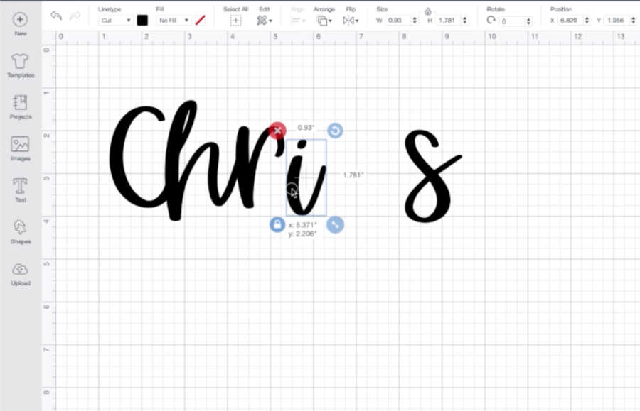
So first we need to connect the letters. To do this, go over to the top of the Layers menu and click the Ungroup button. That will allow you to move each individual letter closer together until it looks like a written-out text.
Once you’re happy with the way it looks, select everything, and then go down to the bottom and click the Weld button, so it welds it together all as one piece.
Now you’re ready to start creating the shadow effect.
Duplicate the Text in Design Space to Create a Shadow
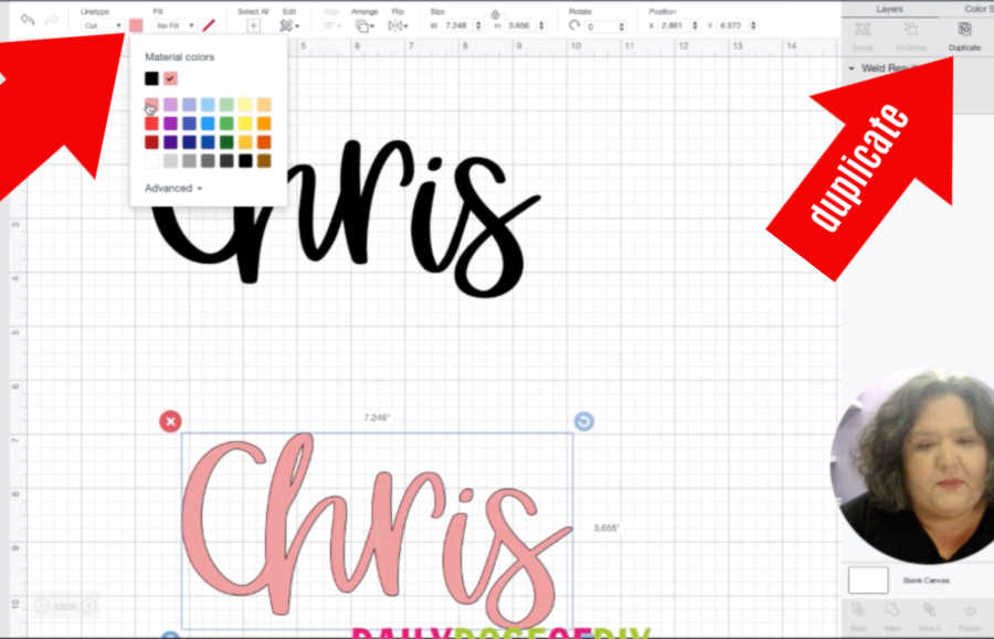
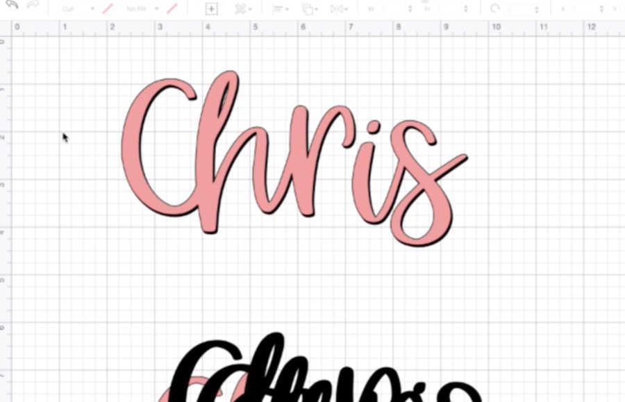
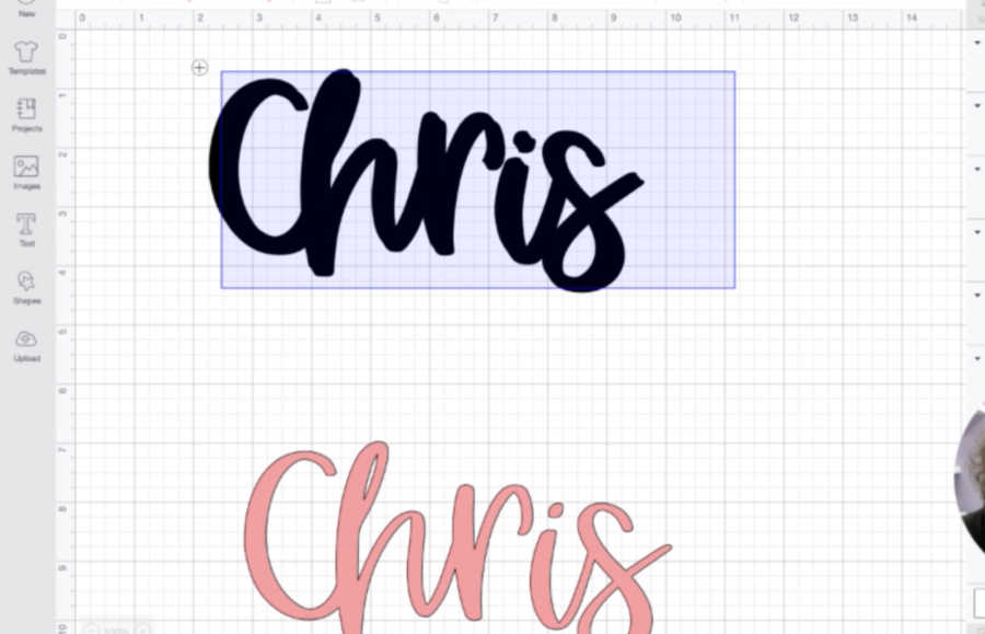
First, go to the top of the Layers menu again and click the Duplicate button. Change the color of the duplicate so it’s easier to see. (You can do this from the left side of the top menu.) Then move that colored layer down to the bottom of the screen.
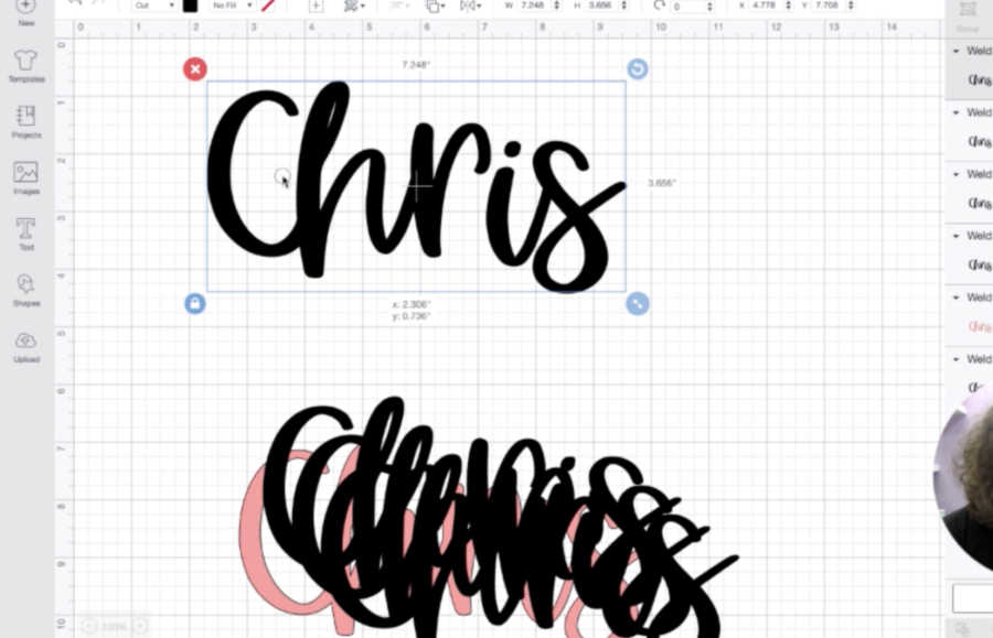
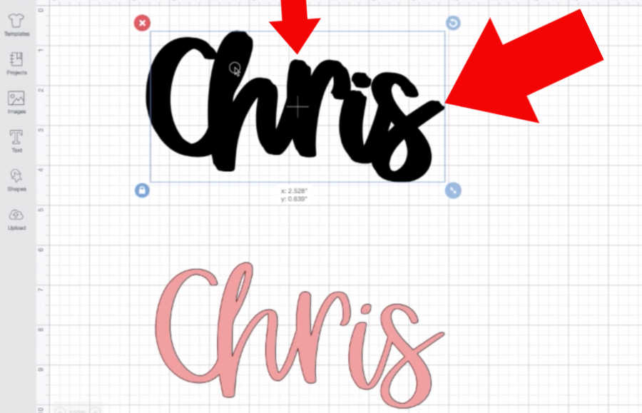
Select the black layer and duplicate it again. Move that duplicate down out of the way, and then duplicate it a few more times. You’re going to stick these layers together to make one thick layer of blackout text that will stand out behind your colored layer.
Now you can start stacking the duplicates on top of each other. Place the first one just a little to the left of the original, and a little up, to make the lines a little wider.
If you want, you can change the color of that one just to see how much it’s offset, but remember to change it back to black before you continue.
Build up the Layers
Then place the next one on top, but just a hair over to the right. I like to keep going back and forth to the left and right until my letters look thicker.
Once you get a few layers done, you can go ahead and select everything again, and then come back to the bottom of your Layers menu and weld that together. So now they’re all stuck together as one piece.
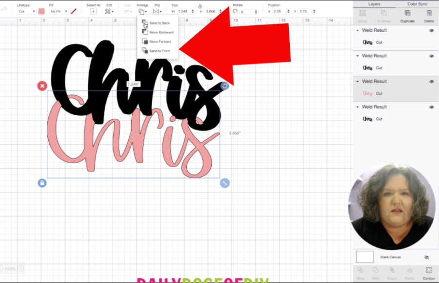
You can also check how the thickness is coming by moving your colored layer up on top of everything. You’ll need to select that layer and go up to the center of the top menu. Click “Arrange” and then “Send to Front.” That way it won’t hide behind the black layers. Then you can move it up to see how much of the blackout text is visible behind it.
I wanted mine to be a little thicker, so I moved the colored layer back down and kept going with stacking black layers together.
Tip: Now that you’ve welded the black layers together into one, you can duplicate the whole thing a few times. It gets easier the thicker they get because now you aren’t working with such thin letters.
Now, you’ll see that the lines on the black letters aren’t going to be perfectly smooth. It looks a little like a brushstroke.
Once it’s cut, it doesn’t tend to be as noticeable, but I do try to watch the ends of the letters and do my best to line them up a little, just so it’s not quite so bumpy.
Test the Offset Layer
Keep testing the thickness by bringing your colored layer to the front and dragging it up on top. Remember, each time you’ll need to select it, go up to the top menu, and click “Arrange” and then “Send to Front.”
If the shadow isn’t as thick as you want, you can just keep duplicating the black layers. You’ll probably have to play around with it until you get it exactly how you want it to look.
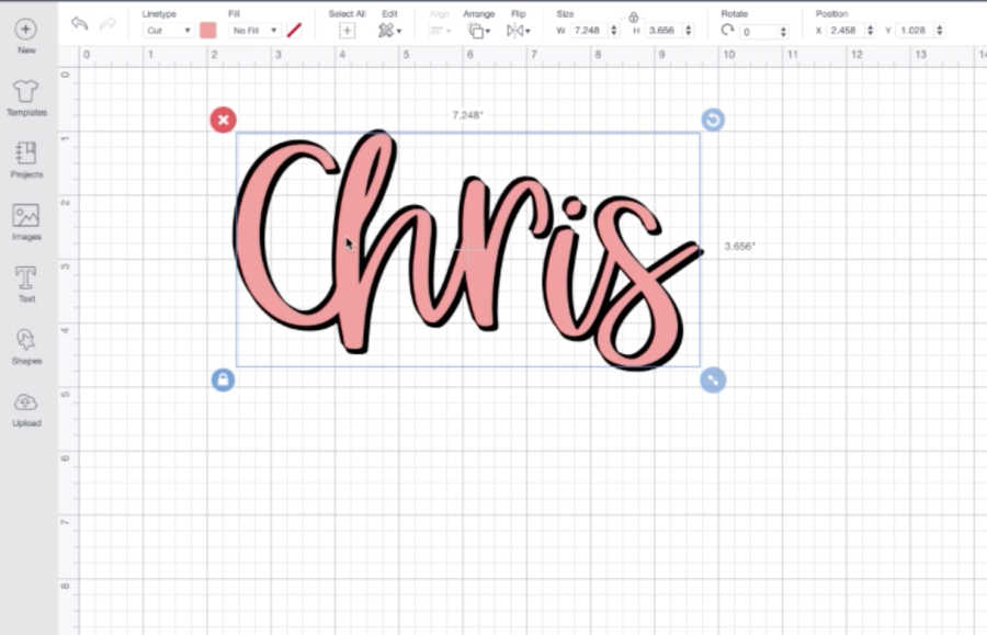
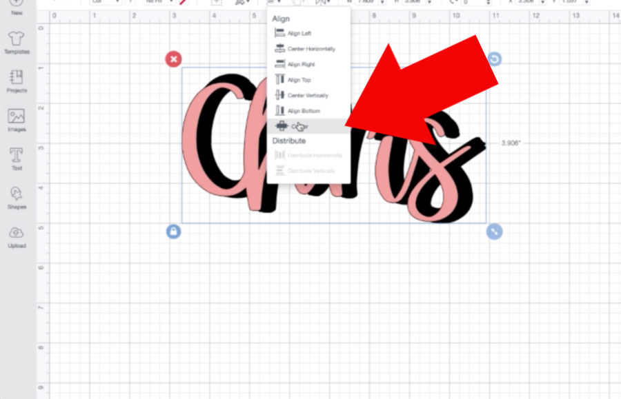
Once you get the black layers to your desired thickness and it looks pretty even all the way around, weld them together one last time. Move your colored layer to the front again, and then select everything. Go up to the top menu and click “Align” and then “Center.” That will automatically center them on top of each other.
Just remember to weld the black layer first, or all of the pieces you carefully arranged will also get centered and we don’t want that!
So now you know how I offset text in Cricut Design Space. I hope you find this trick useful with your crafts!
After you master this, you’ll also want to learn how to layer adhesive vinyl so you can put your shadow text on tumblers, mugs and other fun places.
Thanks for crafting with me today!

Chris Butler has helped thousands of crafters learn how to use their Cricut machine without feeling overwhelmed. She is a best selling author and an up and coming designer. For fun Chris enjoys designing SVG Files, hanging out with her family (preferably at the lake), traveling, and volunteering at her church. She is a wife and mom of two crazy fun kids.
This is so much easier and faster to do in Inkscape. In fact, one of Cricket’s own help desk personnel told me that I should consider using an “outside” program to do what I was trying to do. They suggested Inkscape (a free program), then save as an SVG and upload to Design Space.
Donna, I find this to be true also, though I use Illustrator now. However soooooo many people want to be able to make shadows in Design Space without having to learn another program or download another app and this is an option for them.
Point taken. I didn’t mind learning Inkscape at all. It’s rather intuitive to me. Thank you for letting us in on the secret!
I am just learning how to use my Cricket machine. Thank you for your help in showing how to make the words offset . you are greatly appreciate. Sorry I couldn’t find where to sine up to follow you.
All the tutorials I’ve read for creating shadowed text in Design Space have used a script font and adjusted the letter spacing so they touch are touching slightly. Is there any way to do this with block letters that are not touching?
You are such a blessing! Thanks!
Hello Chis. I’m Hilda. I love this tip because I’m very new at cricut and I one thing I find verry difficult is to weed script letters. Anyway, I have a question: When you did the vinyl decal for the wine glass, did you use this procedure to offset the “Wine time”. if not what is the difference .
Thank you very much for all your help!
No I didn’t use the same method for that. I make most of my SVGs in Adobe Illustrator and in that design program you can make an offset.
Thank you for this! For over 10 years I’ve used Make The Cut and now that that computer died that had the program, I’ve got to get use to using Cricut Design. I’m less than impressed. All you had to do in MTC was click “shadow,” and bam, there an outline. This seems like a really simple feature that people obviously need, there’s really no reason Cricut can’t figure out how to add that and save us all some time and headaches.
I really enjoy your tutorials. I am especially grateful that you post a test instructions and a video to give people a choice. When I start a new project and run into a problem I look to see if there’s tutorials from you first, thankfully you usually have them. So I just wanted to say thank you, I’m sure more people are appreciative, sometimes the little things go on to impact other people’s lives without you even realizing it. When you teach people how to do something usually they share it with someone else.